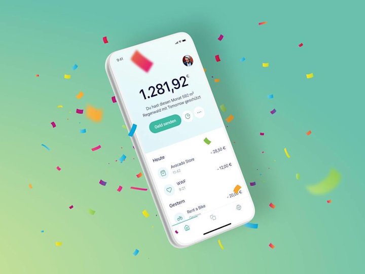
With our new update, a work of art is completed: Although the app looks even nicer and neater than before, it can do a lot more.
Talking about good design is not so easy. It had to be “in your face beauiful”, says Tilmann, our product designer. What exactly does that mean? Well, ultimately, it just has to feel good to the user. Sounds easy, but it’s actually really difficult. Tilmann and seven other colleagues worked on the update for several months. Again and again, they tested, discarded, tested and discarded. But now it is finally here! And now the work of art is completed: Although the app looks even neater than before, it can do a lot more.
This is what’s new:
We have revised your start page. You now see all the important information and features at a glance - including how much rainforest you’ve protected this month.
You can also email money to your friends who are with Tomorrow - and save you the hassle of typing in the IBAN. In your contacts, we also now show you who of your friends is already at Tomorrow. If you prefer to remain anonymous, you can of course specify this in the settings accordingly.
Your transactions are now searchable as well. For example, if you want to see how much money your mobile carrier charged you last time, that works very fast. By popular request, we’ve also added two new Insight categories that you can assign to your transactions: Education, Family & Friends.
We have created a new profile area. You can find all account information in one place there. You can also add a photo of you.
Well? What do you say? We look forward to your feedback, which you can send as usual to our support. Or you can simply tag us on Insta, Twitter and Co.
